Wedding-invitation
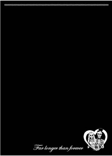
I have been thinking about the design for wedding-invitations the last few days. So I made this draft:


I probably will redesign it 1000 times before the wedding, but it's fun just trying stuff. ^^
I havent decided what font to use for the text that will be on the empty space. "Gothic" fonts usually looks kind of..tacky.
Whisper me something
Postat av: Shannon Rutherford
This is beautiful <3! Funny, yet a little spooky, and romantic too.
It's true, gothic fonts do look kind of tacky sometimes, maybe you should just pick an elegant italic; it will look goth in any case, with the black background and the skeletons :)
Postat av: Sandra
Totally agree with Shannon :)
Postat av: Linnea-Maria
Vilken fin text på kortet! Scriptina är snyggt men det är väldigt populärt bland dem som gillar shabby chic.
Trackback

